Static Pieces
Posters
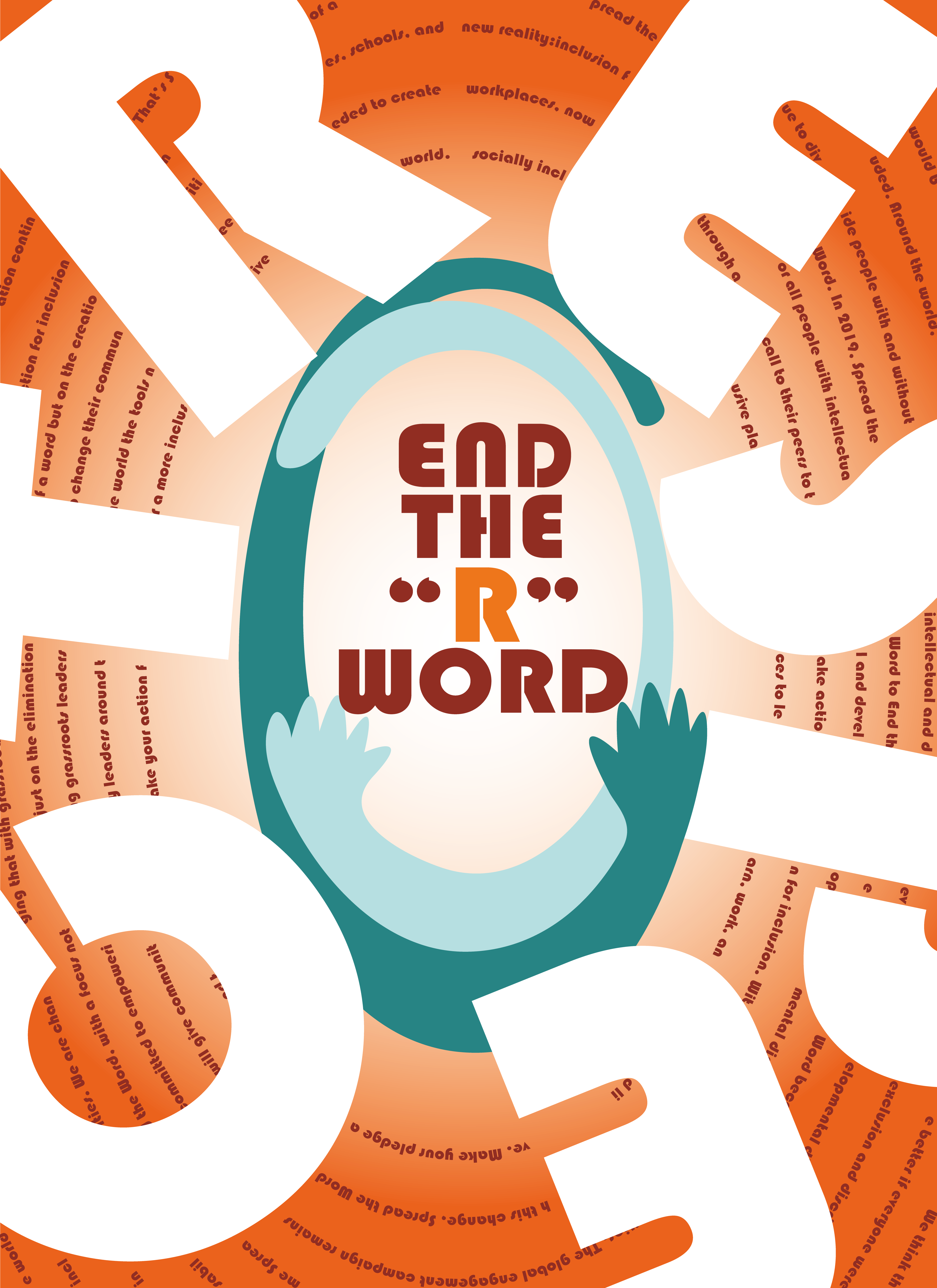

This poster is made for the manifesto, Spread the Word. It is a global campaign working towards inclusion for all people with intellectual and developmental disabilities. It encourages people to stop using “retard”, but respect these groups of people.
I centered my design around the idea of embracing and protecting, so in the poster, there is a visual element of two arms trying to hug these people, and the color I use is mainly a warm color. The intention of enlarging the font size of respect, the origin R word can be forgotten in the process.
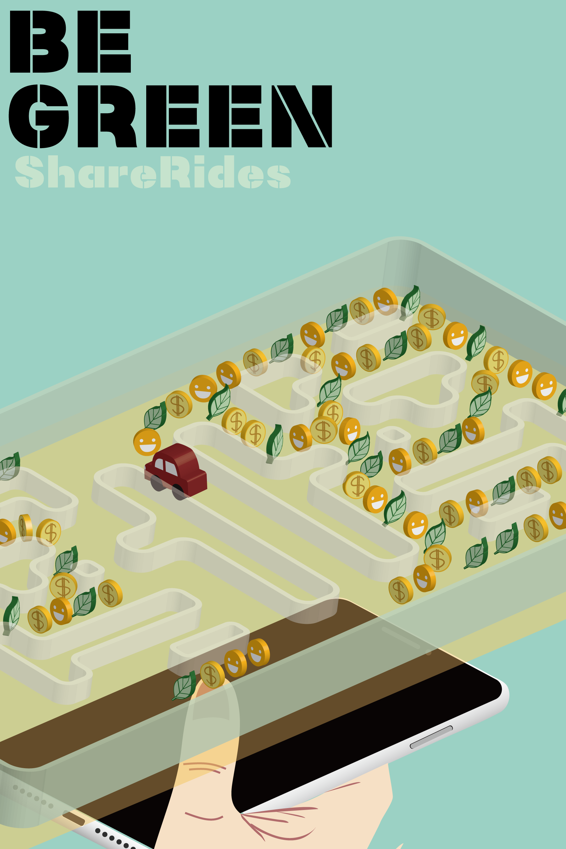
This poster is designed to promote sustainable development, and the area I am tackling is the share ride. I listed three major benefits of share rides and then used symbols to present these benefits including price, social interaction, and it is sustainable. And there are two versions of it.
Fun Fact Booklet
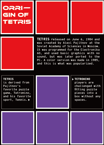

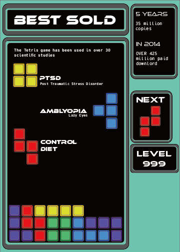
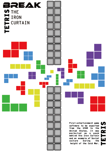
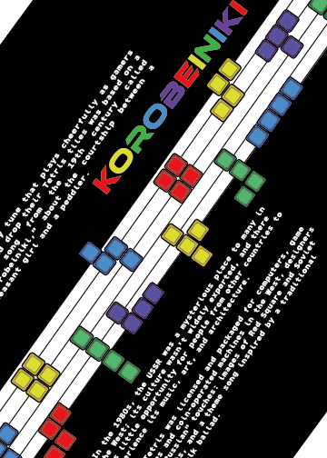
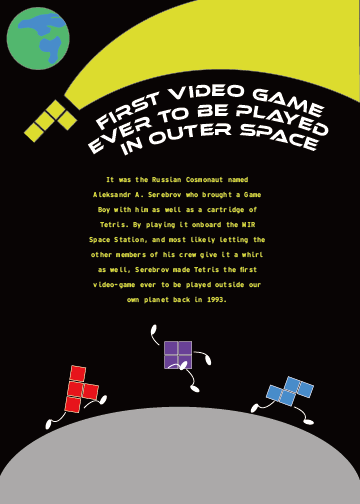
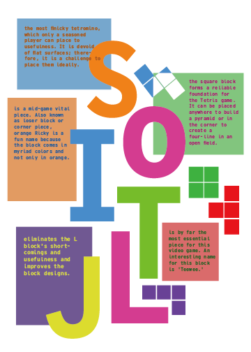
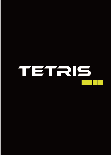
Fun fact booklet is a project based on a topic I am interested in and making a booklet from the topic. The topic I chose is tetris because it is a world-wide game that contains lots of history, and personally I love tetris as well. To design the booklet, I used tetris block pieces as the main elements, and got inspiration from its shape, game panel, and the context of tetris fun facts. Although the font choice is not the typeface tetris used in its original game, the typeface I chose is similar to typeface used in old video games.
Personal ID
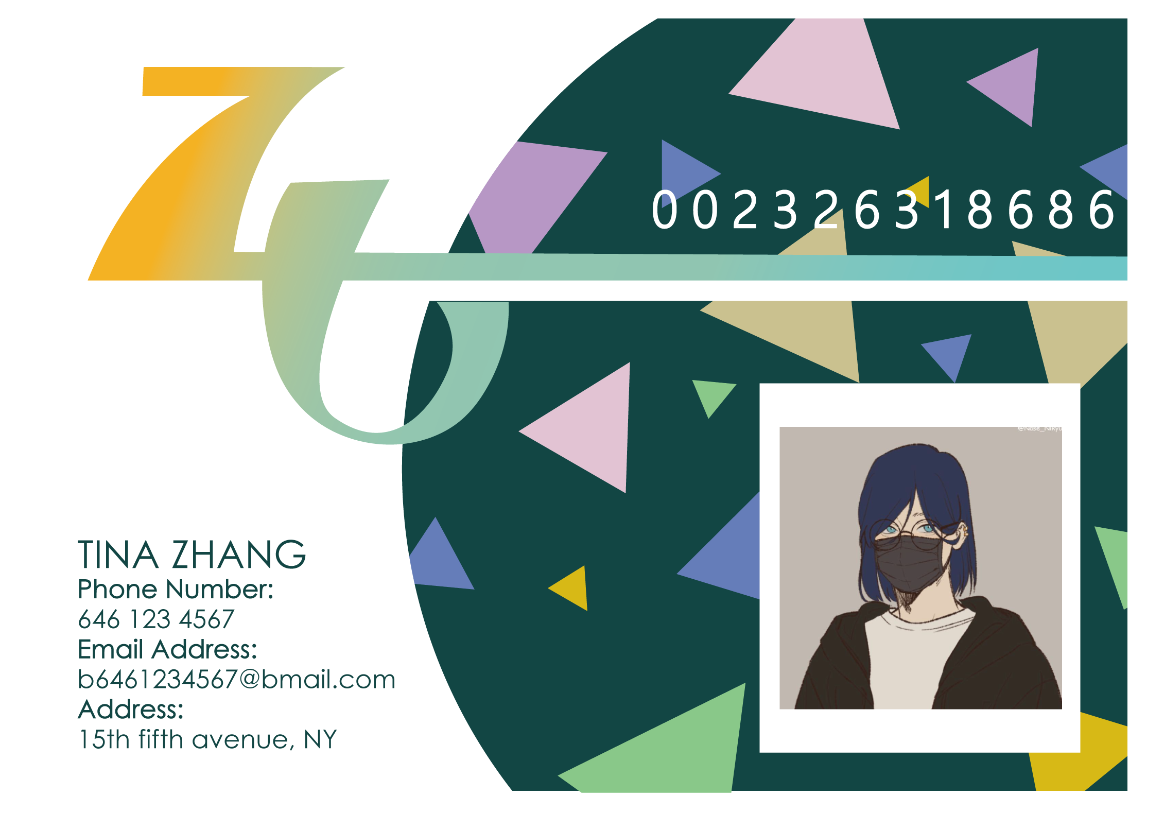
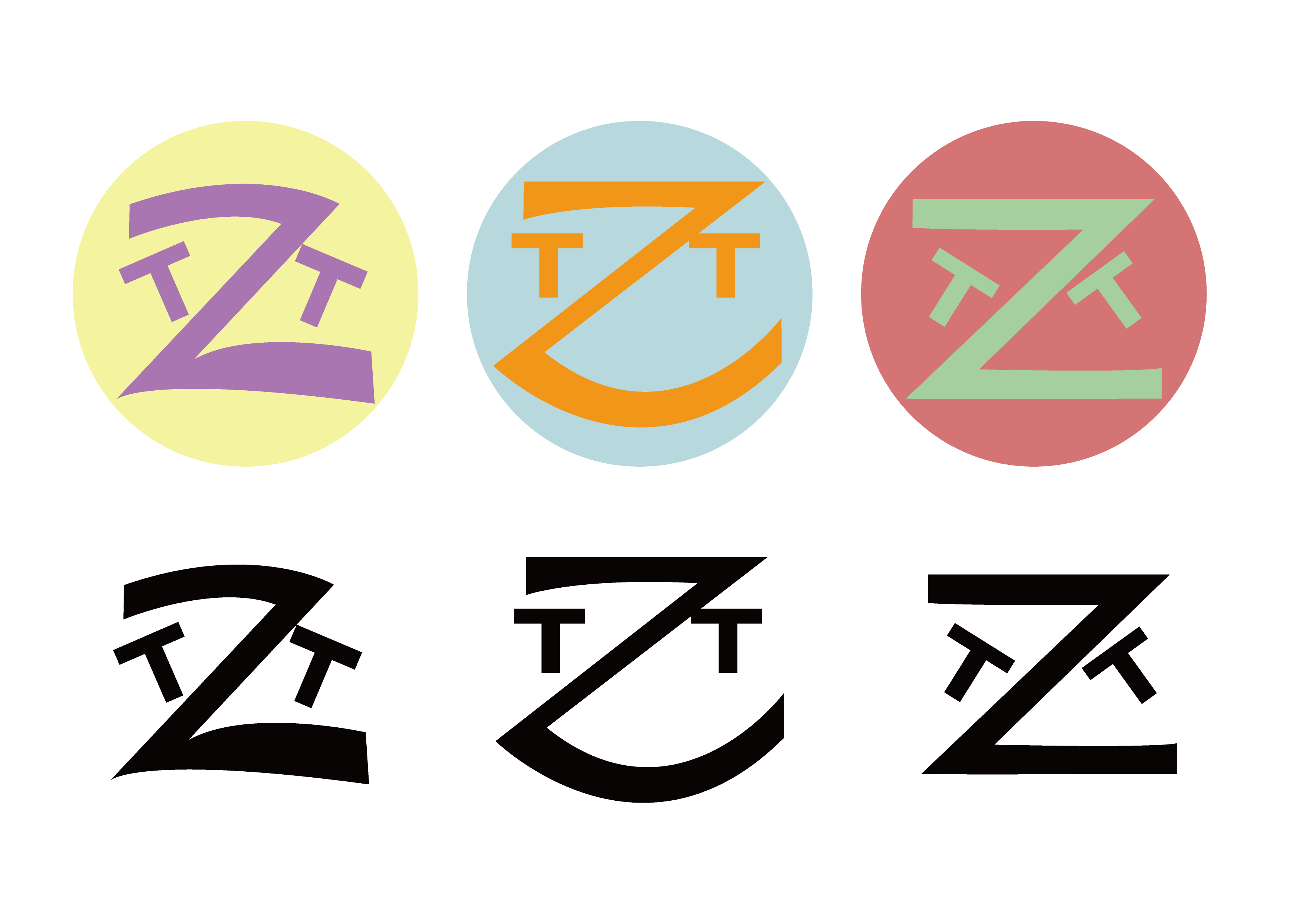

Personal ID is a project aiming to use our name to design our personal business and school card. We need the initials from our name, and design a logo from it, then use this logo in the ID design. I think there is a lot of improvement space for the actuarial ID design, but I like the logo I end up with. I also enjoyed using the letter T and Z to form faces with different emotions, I think this represents my personality as well.
Motion Graphics
In this piece, I made the static packaging for presto! tissue box into a looping motion graphic piece. The circular repeated pattern really inspired me to make this spreading and overlapping movement.
This is a waiting animation for my game in View, if you check my game design page. They share the same art assets. It is small and simple because wait animation should not take up too much space of its function. And because it is a finding game, I used a magnifying glass as the frame for the scene.